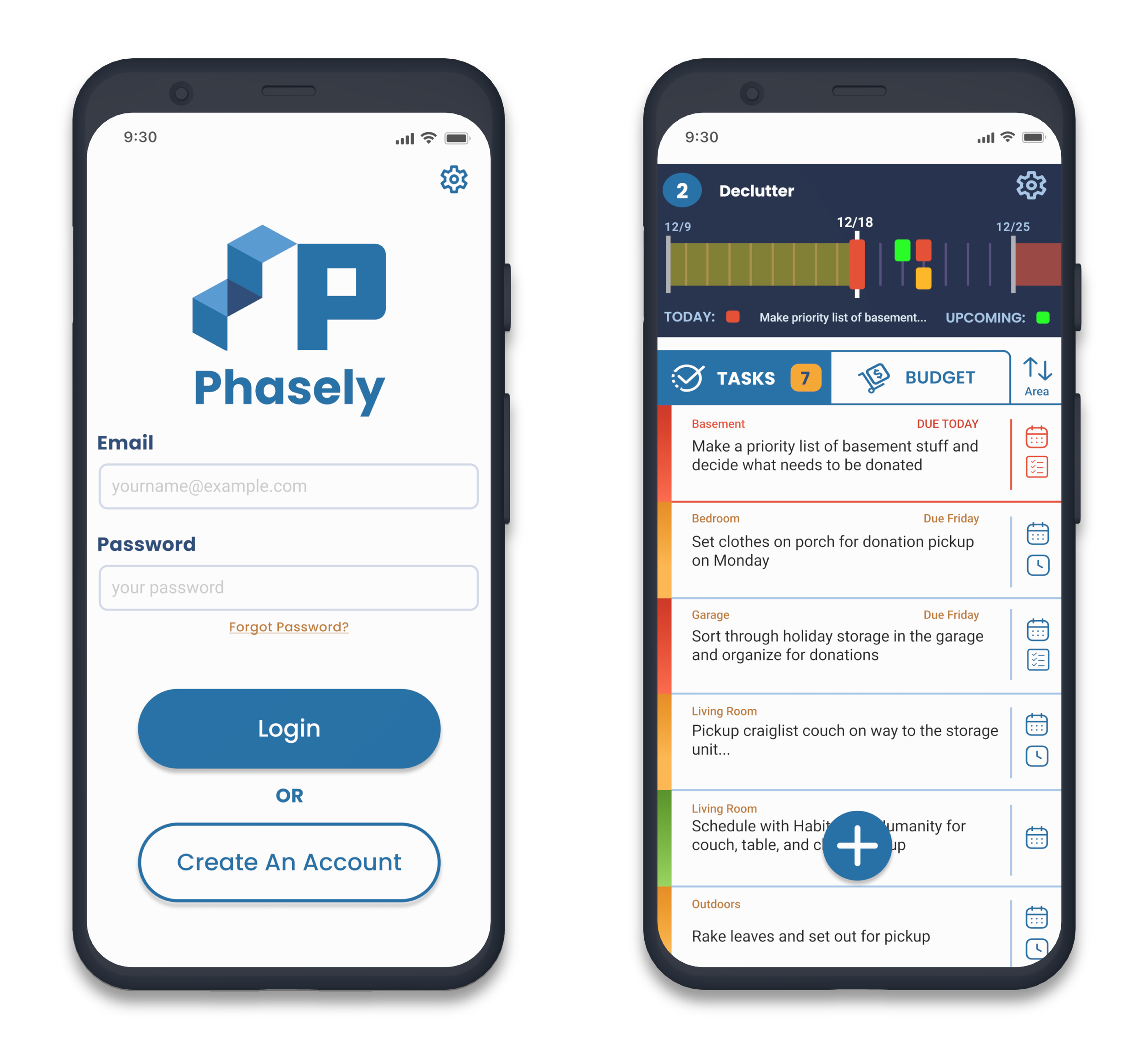
Phasely - Mobile App
UX Design Case Study | Student Project - DesignLab
Role | UX/UI Designer, Graphic Designer, Researcher
Duration | 12 weeks
Phasely is a mobile app that’s designed to make moving easier. It gives users the tools to take on a big life event with confidence by breaking their move into 5 simple phases.

Users can easily manage their tasks and priorities with Phasely’s clean and intuitive interface, setting them up for a smooth and efficient move.
Deliverables for this project were high-fidelity frames and an interactive prototype, where users would complete three tasks demonstrating the core functionality of the app. 
The Problem?
Moving is a monumental challenge and one of the most stressful life events someone can undertake. Managing the endless list of tasks is difficult, exhausting, and it’s all too easy for items to slip through the cracks, further adding to the stress a move.

The Solution:
Develop a mobile application that provides users with the tools and strategies to effectively manage moving tasks, stay organized, and set themselves up for success.
User Interviews

I conducted remote interviews with six potential users that use mobile apps and had either moved within the last six months or were planning to move in the next six months.
My research goals were to:
Identify the different phases of a move and the specific tasks, needs, and blockers in each phase
Determine common pain points in the moving process and opportunities to improve the user experience
Understand how users plan their moves and organize their tasks and to-do’s
Learn the tools and services people use during their moves to accomplish tasks


>>Interview Findings
The single biggest pain point was boxing up and packing their possessions. If done poorly, it can cause a lot of frustration during the moving and unpacking phases.
Decluttering is an important early step; it reduces the amount of things to move and reportedly provides a sense of relief. All interviewees reported they had decluttered or were planning to declutter during their move.
Keeping all the tasks and to-do’s in mind is also a big pain point and tackling this problem is critical for success.
Packing early and making little bit of progress each day was a common moving strategy.
Unpacking is the most exciting and fun phase of the move and getting things organized and in their place quickly after the move was very important to those interviewed.
Competitive Analysis
I conducted additional research via a competitive analysis of four of the top competitor moving apps. I looked at their branding, interfaces, products and services to identify their strengths and weaknesses. This helped me understand the essential problems to solve in this app space and identify opportunities for improvement.
Competitor Key Features
1. Timeline & Milestone Management
2. Box & Inventory Management
3. Checklist & Task Management
4. Booking/Quoting Movers
5. Strategic Partnerships
6. Virtual Floor Plans
1. Clean & Polished UI
2. Integration w/ Service Providers
3. Project Management Features
4. Inventory/Box Management
Strengths
Weaknesses
1. Lack of Default Task Libraries
2. Timeline Management
3. Task Customization
4. Budgeting Tools
Research Synthesis
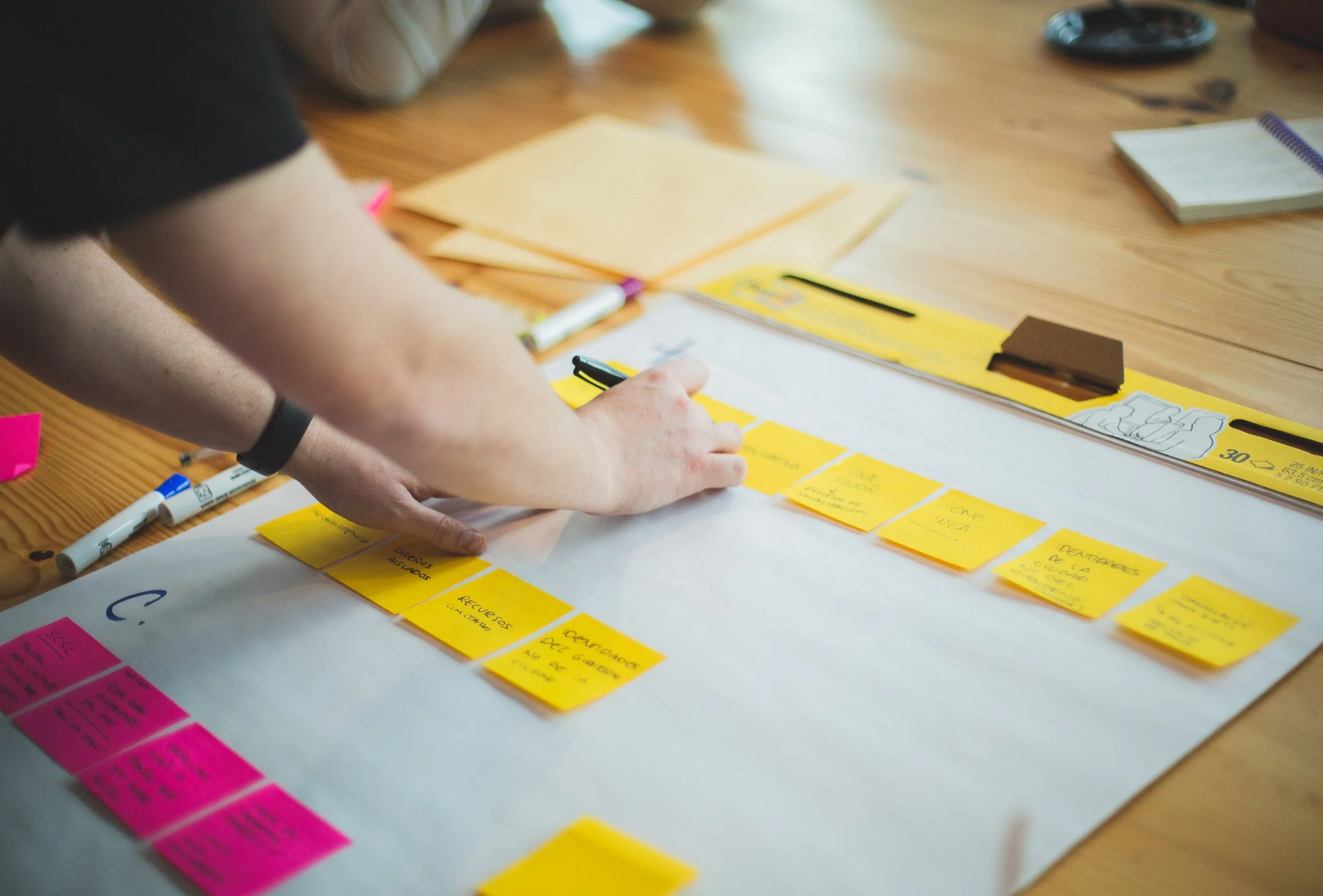
I developed additional artifacts like an Affinity Map, and How-Might-We/POV statements to digest the research and synthesize insights. This brought into focus the concerns and needs of potential users, and I later performed a Card Sorting exercise with the interview participants to help me better understand the app’s information architecture.
Card Sort
The goal of the exercise was to gain insight into how users categorized a set of topics related to my app’s features and architecture. I determined it was important to focus the app on the task and timeline management features before moving into low-fidelity wireframes, making the Task Manager the focus of the app.

Empathizing with Users
Creating User Personas was the last essential step of discovery and it provided many important insights into the unique moving journeys of potential users. Identifying their core concerns and motivations provided an excellent springboard for ideation and problem-solving.
Persona 1
Persona 2
Persona 3
Key Ideas from Discovery Research


The Ideation Process
After completing my research and developing some key insights about the process and pain points of moving, I began to explore features and solutions that could address the needs of my potential users.

Brainstorms
I let the ideas flow from a non-critical frame of mind. Any and all ideas were innocent until proven guilty.

Feature Exploration
I sorted through those ideas to identify features that could address user pain points and deliver a valuable experience.

Storyboards
I put my personas and features together, illustrating real scenarios to bring my ideas to life and put the app into perspective.

Key Ideas from the Ideation Process


The Development Process
With key features and the direction of the app decided, I began to define the branding, visual design, and information architecture of the app.
Branding & Visual Design
I wanted to establish a brand identity that gave users confidence, one they could trust to get them to the finish line.
Site Map
Clear navigation is critical for a good user experience; it’s important the app feels familiar and predictable.
Flows & Wireframes
With my architecture and personas in mind, I translated user needs and goals into a roadmap for wireframing, and from there the app began to take shape.
Brand Identity & Visual Design
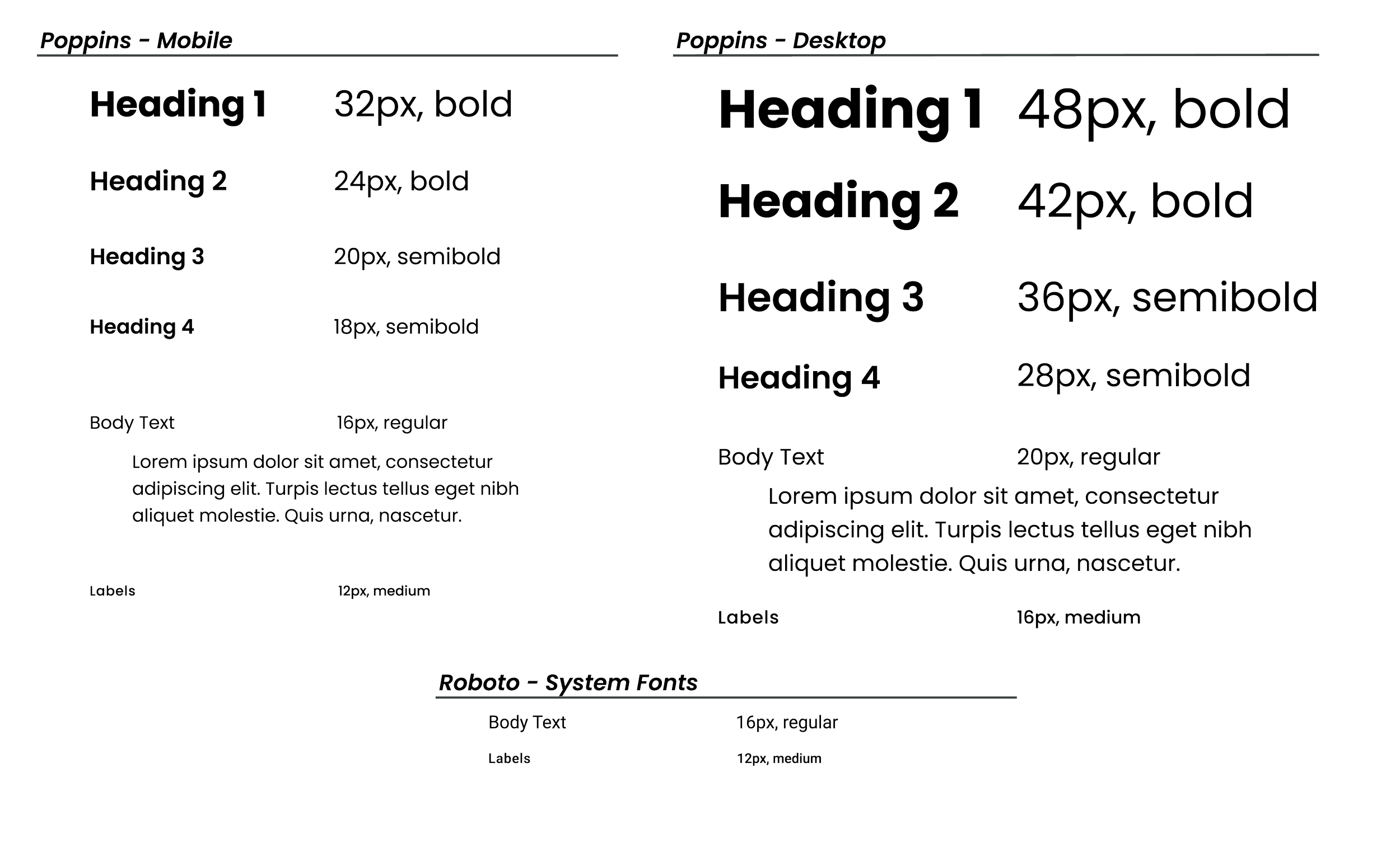
Moving is huge undertaking and Phasely users must trust in the app and the process. That starts with a brand identity that inspires confidence. Blue as the primary color evokes calm and instills trust. The secondary yellow brings excitement and energy to the user’s journey through the app, while clean and modern fonts present the user’s information and app UI clearly.
Color

Typography
Logo
Initial Sketches
Digital Exploration
Final Logos & Wordmark
Icons + Buttons
Sitemap, User Flows, & Task Flows
Establishing the app’s information architecture informed every design decision that followed. It was crucial to understand the core flows that users need in order to complete tasks, both to ensure the user experience is smooth and logical, and there is no wasted design time working on non-essential tasks or components.
Sitemap
User Flows
Task Flows
Low-Fidelity Wireframes
My process always starts in a sketchbook. I worked through understanding the required tasks, components, and UI elements for the main screens. Then proceeded to develop the initial layout of the two core features of the app: the move dashboard and task manager.
Initial Concept Sketches
Dashboard & Phase Manager v1
Dashboard/Phase Manager v1.1
Phasely Anatomy - “Move Dashboard”
Phasely Anatomy - “Task Manager”
Mid-Fidelity Wireframes
In this next iteration I added color, refined the concepts, and worked to understand the core functions of these screens. The importance of simplifying both the visuals and the concept became very clear, and from here on, I decided to scrap the Dashboard all together and make the Phase Manager the star of the app.

High-Fidelity Wireframes
With the dashboard scrapped and the Phase Manager clarified, the final design and layout of Phasely began to take shape. It was now time to put the wireframes in the hands of users and move to prototyping.

Prototyping & Usability Testing
With the Phasely prototype in the hands of capable users, I conducted 5 usability tests to understand how well users could navigate the app to perform 3 tasks.
User Feedback
Initial testing revealed some excellent opportunities to increase the visual clarity and flow of the app. Users provided thorough feedback on both usability and visual design.
Usability Testing - Key Takeaways
With key features and the direction of the app decided, I began to define the branding, visual design, and information architecture of the app.
Task 1 - Creating a Plan
Flow was visually and functionally clunky. Simplify and clarify around the core task.
Users didn’t fully understand the phases, onboarding screens could be very beneficial.
Users liked the color palette and overall interface design. Contrast was good and visual hierarchy was clear. Need to remain consistent across components and screens.
Phases were unclear
Visual design is solid
Task 2 - Add New Tasks
Users were very successful because their next steps and visuals were clear.
Don’t be afraid to separate screens or let users discover components. It encourages exploration and learning.
Users should be able to view the tasks for a given phase, adding task info in phase setup would help clarify timelines.
Simplify
Task-First Mindset
Phasely Final Screens
Usability testing provided some great insights into ways to improve Phasely’s visual clarity, usability, and functionality. I’ve taken this feedback and refined the screens.
