LifeDraw - Mobile App
UX Design Case Study | Student Project - DesignLab
Role | UX/UI Designer, Graphic Designer, Researcher
Duration | 8 weeks

I designed LifeDraw, a mobile app teaching users to draw the human form. It offers an intuitive platform for all skill levels to learn and practice figure drawing. This project gave me valuable experience managing a digital product from idea to launch.

My goal was to create an engaging app that motivates users to learn and track their progress. I delivered high-fidelity mockups and an interactive prototype showcasing core functionalities.
Research
To better understand the current landscape of art/design educational apps and services, I conducted a competitive analysis of the top digital learning platforms and mobile drawing apps. I also surveyed potential users about their learning habits and styles, their art experience, and their interest in learning to draw the human figure. Finally, I interviewed an experienced educator to learn effective strategies for teaching ourselves and others a new skill. After synthesizing my research, I came away with key insights into the design and function of my mobile application, ready to jump into conceptualizing and defining the app's features. Research Objectives
Analyze the design and function of current drawing apps and digital learning platforms (Competitive Analysis)
Understand users attitudes concerning self-teaching and drawing experience (User Survey)
Identify best practices and strategies for self-learning and adult education (Educator Interview)
Competitive Analysis
I analyzed five of the top online educational services that offer art or design instruction: LinkedIn Learning, Masterclass, Skillshare, Udemy, and YouTube. My goal was to identify common design patterns and teaching techniques that I could potentially incorporate into my own design, improving the usability and effectiveness of the educational information.My LifeDraw app needed to have clear informational and visual hierarchies to keep users’ learning on track, encourage exploration of the app, and Curriculum activities and practice sessions should be intuitive and easy to navigate. The better users can fit the learning and practice into their busy lives and schedules, the more likely they’ll be to engage with the app and curriculum to improve their drawing. I also looked at popular mobile drawing instruction apps to identify any interesting features or strategies used to help users learn figure drawing. The most common type of drawing app I came across offered step by step tutorials for drawing specific objects and characters. These techniques could be helpful for some aspects of figure drawing like understanding proportion or the basic anatomical shapes, but I needed to consider more robust lessons to help users understand the fundamentals of more complex ideas like gesture, line quality, and value. As part of my research, I also investigated some mobile apps that offer artists 3d modeling tools for reference and inspiration. Having a tool to visualize the figure in different positions and lighting setups would be fantastic for my users, providing them infinite poses for exploration and reference.User Survey
LifeDraw is an educational app; it was important that I understood my users’ learning preferences, styles, and experience and comfort level teaching themselves a new skill as I move into designing the app and curriculum. Survey Results
Two-thirds of respondents reported to be visual (58%) or kinesthetic (8%) learners.
90% reported having a good amount of experience teaching themselves a new skill or hobby, and 33% were very experienced.75% of respondents enjoy teaching themselves - 50% of these enjoyed learning in a classroom and on their own equally, 16% preferred learning on their own, and 8% preferred a classroom setting.83% of users have experience using digital tools like YouTube to teach themselves a skill or hobby. Users appreciate being able to learn at their own pace, and be able to rewatch videos or sections when necessary.Most respondents had only grade-school or high-school level art experience, but 92% were interested in improving their skill drawing people.25% of respondents enjoy doodling or sketching as a hobby, but get frustrated quickly, and half of those surveyed would want to learn about figure drawing, but don’t know where to begin.Only 42% of users wanted to share their work and receive feedback from peers or instructors. 50% were a maybe, and 8% definitely would not share their work.
Survey Insights
Based on my users responses, I should gear the app towards visual learners rather than auditory or reading/writing learners.
Integrating some classroom-esque concepts or components into the app could improve the user experience and increase engagement.The app’s lessons should show a clear progression of skills and concepts to help them establish strong fundamentals and provide context for their learning.Lessons and activites need to serve a range of users and their varied experience levels, so there should be a good mix of fundamental and more advanced coursework.Users were split on sharing their work and progress, which suggests that users should be able to solicit feedback or post their work, but this should be an optional feature as less-confident users may be discouraged early on.
Educator Interview
“Trying something new can be intimidating, children are more exploratory and constructivist with their knowledge...adults are more close-minded and less explorative because they tend to not like being bad at things.”
Interview Insights
As we age, we tend to become less exploratory and more close-minded in our learning; this comes from insecurity about our own knowledge, fear of failure, or anxiety about being bad at something new. Children are much more exploratory and willing to expose themselves to new ideas and concepts.Group/social learning can be very advantageous, allowing students to gauge their understanding against peers and synthesize others’ work and learning into their own.Teaching children often starts with an activity to engage and get their wheels turning. In older students and adults, providing concepts front allows them to contextualize the knowledge, making them more comfortable in exploring during abstract exercises.Step-by-step lessons and activities while learning a new skill help to contextualize the information and help users connect skills and concepts that build on each other.Providing the foundational information up front, followed by quick exercises or “formative checks” helps to cement new concepts, especially for an abstract skill like figure drawing. Exercises followed by slower self-practice modules can help keep users engaged and trigger chemicals like dopamine in the brain to reinforce the good feelings associated with learning a new skill.Giving users a structure for self-practice modules will be important, for example building practice timers into practice modules gives students a chance to explore a concept, but in a limited way that will keep them from getting burnt out.LIfeDraw lessons should be specific and targeted as older learners can quickly become intimidated and not know where to start with such a broad topic as figure drawing.Lessons and tutorials should come before activities or exploratory exercises.
Research Takeaways
Video lessons should be the basis for instruction within the app.
Figure drawing is inherently visual, and since the majority of potential users are visual learners, providing tutorials in a video format with an instructor working through the lessons/exercises step-by-step will be a highly-effective method of delivering the curriculum. The curriculum must have clear visual and informational hierarchies.
Figure drawing requires a mastery of many different skills that all build on each other, such as gesture, construction, value, line quality, and anatomy. It's important that users understand the material in the context of these other skills and can easily navigate the information.Lessons should be followed up by formative checks like activities, exercises, quizzes and self-guided practice modules.
Adult learners engage with and retain information better when lessons are presented first and then followed by formative checks and activities. These provide users the opportunity to reinforce and explore their understanding of the new materials and concepts. Feedback/Sharing from users should be optional and secondary to learning the curriculum and practice.
My survey results showed a majority of users were hesitant about sharing their work, likely due to a lack of confidence in their abilities, so feedback/sharing features in the app should be optional or more limited. Providing users additional 3D pose and reference tools could accelerate their learning and growth.
These tools encourage users to explore and find their own ways of problem-solving the figure. With unlimited ways to pose and reference the model, they will start to connect and apply these concepts across all references, and not lesson or activites specific poses.Define
Having completed my research, I needed to define what problems my app would solve for users. I developed key Point of View statements to help me understand the state of mind of my potential users, and then created several “How Might We” questions to focus the design into solvable problems. Finally, I created three User Personas to build empathy with potential users and understand the motivations to learn figure drawing. POV Statements
I’d like to find ways to break down the overwhelming subject matter of figure drawing into discrete and digestible chunks that beginners and experienced users can teach themselves.
I’d like to identify ways to empower users to be creative but disciplined in their practice so they can feel comfortable exploring and experimenting on their own.
HMW Questions
How might we help people feel comfortable and minimize the frustration of teaching themselves a new and at times frustrating skill?
How might we provide a platform for users to easily engage with a wealth of information and tools without making them feel overwhelmed?
How might we keep users engaged and the lessons fun and interactive so they are excited to practice and improve on their own?
How might we encourage users to keep at it when they are feeling discouraged or frustrated by their progress?
How might we empower users to be creative and take chances when learning and trying to achieve their own goals for self-improvement?
User Personas
Now, having outlined the main questions I needed to answer for my users, I wanted to understand people may want to learn or improve their figure drawing. One of the best ways to do this was to develop personas, which helped me build empathy with my potential users.

My users will vary in their urgency and motivations for learning figure drawing. From a young fashion professoinal, to a budding high school illustrator, to a retired art instructor, I built these personas to demonstrate how that variety could translate across users and help me design the app in a way that they could all work it into their busy lives.
Feature Set
Next, I began developing a list of features and components that could help users meet their goals. I drew upon my years of teaching myself this very subject and considered the tools and activities that had been helpful in my own learning trajectory. I worked with my mentor to sort through the list of features, developing some additional ideas and giving the app a clear direction. Site & Lesson Maps
To understand how the various elements would work in relation to each other, I organized the features and components into a site map to give me a bird’s eye view of the application. In this stage, I decided there would be 5 main components to the app:Lessons, Sketch Journal, Practice Modes, Community, and Resources. Since the lessons/activities would be the main focus of the application, I knew I needed to understand and define what this process would look like, so I mapped out lesson structure and process.User Flows
With a solid understanding of the structure and basic function of the LifeDraw app, I identified core user flows that I would need to demonstrate and deliver in my prototype and minimum viable product. Branding
With the structure and user flows designed, it was time to turn to the look and feel of the app itself. I began by designing the app’s logo and wordmark. I knew I wanted to incorporate a representation of the figure somehow in the logo, and after a couple hours of sketching and ideation, I landed on what would become the final concept and logo. Purple is often associated with creativity and imagination, so it seemed a natural fit to be the main color of the app. Figure drawing is most often done in dark mediums like charcoal, graphite, and ink so black seemed like an excellent complement to help keep things clean and minimal. Keeping the color scheme simple, the palette limited, and using a modern and sans serif font would also help to keep the users' artwork and posts the main focus. I created the menus, buttons, and other visual elements to reinforce the theme and keep the interface simple, clean, and free of clutter.
Create
At this point, I've completed my research, defined the user problems, and developed a logo and branding to support my design goals. Now I needed to translate these ideas into wireframes and understand how the elements will work together and see if I need to re-imagine a concept or feature.Initial Wireframe Sketches
I decided to design this application for primary use on a mobile tablet. The larger screen area would offer users more room to draw and see clearly the specific artistic strokes and choices made by instructors in the video lessons. On the flip side, having more space meant that if I wasn't careful, I could easily overcrowd the various tablet screens, so designing and implementing the simplest, clearest version of each feature would be crucial. I also needed to utilize the native controls and tools of the tablet, ensuring a consistent and familiar experience as users navigated the app. Low-Fidelity Wireframes
After sketching and working through the various screens that I’d need to deliver in the MVP, I was prepared to start creating my digital low-fidelity wireframes within Figma. My goal here was to block out the main components of the various screens, and avoid getting lost in the details at this stage. Determining how best to include the desired elements from my feature set and apply the ideas in their simplest forms required a lot of thought, but having sketched out my initial wireframes, the low-fidelity digital wireframes came together quickly.LoginSketch Journal - GridDashboardLessons / ActivitiesSketch JournalPractice ModeVisual Design / UI Kit
My visual design process really began with my low-fidelity wireframes. Having established the general layout of the screens, my next step was to figure out how elements like text boxes, buttons, and menus would work visually within the available space, and convey the brand message and a sense of confidence in the users.Designed for an Android device, I used native icons where applicable and any custom icons I created were designed to match the aesthetic and feel of the system icons.
Color and variations of elements were kept minimal as I wanted to keep the focus on the imagery and learning information.
I massaged the visual elements I’d created into the low fidelity wireframes, breathing the first bit of life into the concept.
Initially, the wireframes inform the visual design, but as elements come together, the visual design starts to inform the form and function of the screens and user experience.
You learn a lot about the function of your app in this stage of design. The ideas and plans meet the reality of the situation, and there’s an exciting back and forth that between design and function that ultimately lead you to the next step, high-fidelity wireframes.
High-Fidelity Wireframes
I continued to develop the look and function of the app altering the menu structure to better reflect the native tablet functions, simpifying frames and components, and making sure to highlight the right information to maximize its impact on users. With the high-fidelity wireframes completed, I was ready to create the interactive prototype and get the app in front of users for testing.LoginSketch Journal - Fullscreen PostDashboardSketch Journal - GridSketch JournalSketch Journal - New EntryLesson - StartLesson - CompleteActivity - StartActivity - EndPractice - Photo SettingsPractice - In ProgressPrototype & Testing
With the key user flows in mind, I began linking all the screens to make the prototype interactice. I then conducted five live testing sessions over Zoom with potential users of the LifeDraw app. I gave them three tasks to perform: Complete a Lesson+Activity, Create a New Sketch Journal Post, and Start a Practice Session.Testing Results
The usability of the LifeDraw app during testing was good. Users were able to complete their 3 tasks without any major issues, and a few tweaks will help to clarify a few questions that came up during testing. Overall, the app functioned as the users expected in terms of buttons, navigation, and lessons/activity.

The Visual/UI Design of the screens is solid; users felt the colors, menus, and visual hierarchies made clear their next steps and organized the informxation like the lessons and activities well. Users liked the clean layout of the dashboard, and felt the minimal use of color kept the focus on the artwork and information. They also liked the layout of the sketch journal, and said it felt like a real physical journal the way it was laid out.
User Feedback Grid
Revisions & Next Steps
I’ve identified a couple areas where I can improve the clarity around user’s next steps and the apps function. For example, adding a marker to the popup navigation menu would make it immediately clear that users could go there to access the apps main components. There was some confusion on the practice screens. The first screen of photo practice mode where users define their photo reference options doesn’t make it clear that the image viewer to the right is inactive.  I can improve this possibly by moving the “Begin” button into this area. When choosing the practice mode, I need to provide a screen where users have the option to choose the mode; currently the prototype goes right to photo reference mode.

The function of the activity section of the prototype was a bit confusing to some users since they could not actually draw on the screen using the brush or shape tools. Users were still able to complete the task having walked through the activity and understood how it would function in reality. Since I cannot demonstrate the drawing function of the app, in this case, I could potentially add a “submit” button to make it clear to users they must perform an action, while also signifying the transition to the next stage more clear.

Overall, testing went well and demonstrated that users could engage with the app and its features to learn or improve their figuring drawing. I’ll make a few adjustments to the app prototype to better define the users next steps and improve the visual clarity of the final screens.
Conclusion
Designing an end to end application was the perfect test and culmination of what I have learned in my time with DesignLab. Developing the app around my passion for illustration and figure drawing was extremely fun. From its conception, I knew exactly what wanted the app to be and I believe I have delivered a well-designed and functional app prototype.

Armed with a clear idea and now well-practiced in the research phase, I felt empowered and confident building my surveys and interview guide. I knew exactly the right questions to ask to help focus and refine my concept. Designing for a tablet was also a unique challenge; having to deal with a larger screen than I had in my previous capstone projects, I was really conscious not to overcrowd my screens and make sure I was simplifying as much as possible. Incorporating the native abilities of the tablet like drawing, camera, and navigation functions added a lot of realism and practicality to the app as well.

Across the spectrum of my DesignLab projects, I’ve struggled consistently with time management and getting sucked into the details early on, costing me energy and effort in the long run. This time around, I spent more time developing the high-level ideas and structure before delving in details. This helped me produce a more cohesiveness design and shows in the quality of the final product.
LifeDraw Final Frames
Below are the final screens for the LifeDraw app. The design is cohesive, functional, and highlights the user artwork and the app’s educational information well. Having spent years coralling the information, techniques, and resources to teach myself figure drawing, I am very proud of my final deliverables, and wish I had an app like this when I began my own figure drawing journey. Login
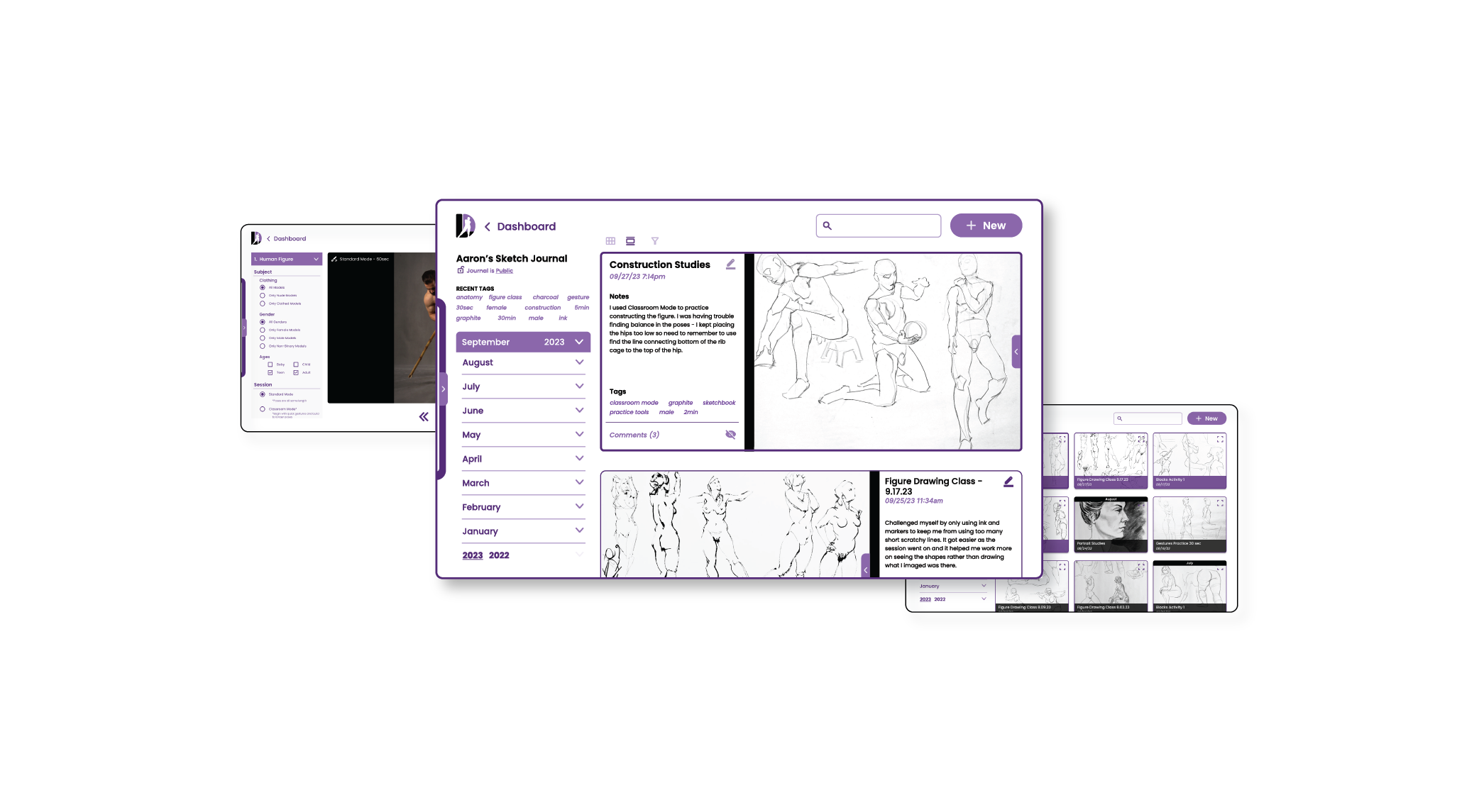
Dashboard
Lesson Start
Lesson Fullscreen
Lesson Complete
Activity Start
Activity End
Sketch Journal - Scroll View
Sketch Journal - Grid View
Journal Post - Fullscreen
Journal Post - New Entry
Journal Post - New Entry Complete
Practice Session - Mode Selection
Practice Session - Active
Practice Session - Fullscreen